Helpful Hints
A collection of tips and tricks to help you with your entries.
The Top Five
By: Eric Scheur
Published November 8th, 2010
Every month dozens, if not hundreds of animators enter the 11 Second Club competition. Some are seasoned professionals looking to polish up their skills, and others are just starting out, eager for more practice.
One of the amazing things about the voting period is that any registered user can comment on any entry, offering their praise and/or constructive criticism. This helps foster a sense of community, with everybody helping out everybody else. And the result, hopefully, is better and better animation.
Month after month, however, we see the same kinds of comments appear--usually in the lower-ranked submissions. So I thought it might be useful to gather up the Top 5 Most Posted Comments and explore what might help get past them so you can start to receive the kinds of comments that will really help push your character animation to the next level.
Ready? Here we go!
COMMENT #1
"You aren't ready for the competition."
"You should return to the basics."
Every animator knows the feeling of just starting out. You want nothing more than to grab a rig and start crafting a performance. And even though you're aware that you should probably start by developing a few of the basic animation skills, you convince yourself that those basic skills will come in the course of trying to tackle the more difficult animation.
But that's never the way it works out.
So if you are new to the club, or you regularly find yourself frustrated by the same "you need to return to the basics" comments month after month, maybe it's time to consider taking a step back and actually practicing some of those fundamnetals after all. There's nothing wrong with taking a few months off from the competition to improve your basic skills. I'm certain that everyone who has ever won the competition would tell you that they wouldn't be where they are without being very familiar with the basics.
I once read an interview with Patton Oswalt (a hilarious stand-up comedian, known to most of us as the voice of Remy in Pixar's Ratatouille). He was talking about comedians who begin their careers by trying to bite off more than they can chew, but it's a great analogy for anyone trying to learn a new art form:
It's like a guy saying, "You know what I'm going to do? I'm going to start off as a four-star chef." Well, can you cook a cup of rice? "No." Can you cook an omelet? "No." Well, why don't you start off learning how to cook rice, and by the way, that takes about a year. Four star chefs take a full year learning how to cook rice and how to cook omeletts. "Well, I'm not going to do that." Well, then you're never going to be a four-star chef.
(You can find the full interview here. Note: the interview contains some strong language)
Give it some thought. Here are some exercise ideas you can try if you really want to improve those basic skills:
Try one of these exercises. Do it once. Then do it again, then do it again. Get feedback from your friends, colleagues, family members, or the 11 Second Club community in the Personal Work forum. You'll find that once you come back to the competition, you'll be that much further ahead than everyone else who is still struggling to master the basic skills.
COMMENT #2
"You need stronger poses."
One of the first skills a character animator needs is the ability to create strong poses. It's one of those "Do you know how to cook rice?" things. (see above)
During the 11 Second Club voting period, you're presented with animation after animation. But before you even press play you see that movie's poster frame. That is: You see a pose. And I'll bet that once you see that pose you are already starting to form an opinion about the animation. If that one initial pose is not very dynamic, or interesting, or compelling, you're likely to think that the animation will be lackluster as well. And it usually is.
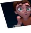
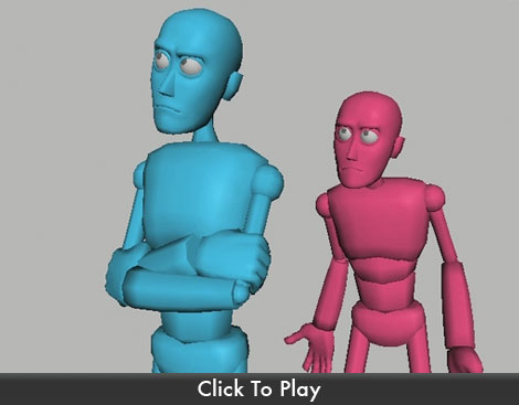
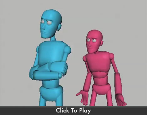
Here is an example of a pose you might see by a less-experienced animator, contrasted with the same idea presented in a stronger pose.
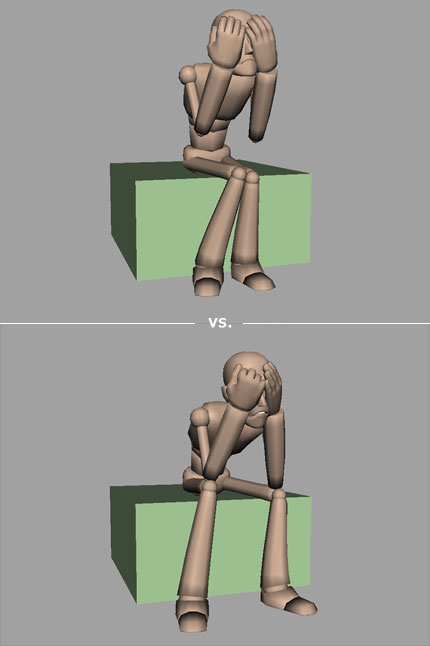
We can tell that the character is despairing. He's frowning and he is covering his face in shame. These are "indicators" of despair. (see the Helpful Hint Acting It Out for more information on "indication") But the first image lacks a certain believability that we find in the second image. Let's break it down further:
This character feels like he has more weight, both physically and emotionally. He is practically slumped over onto himself (as can be seen in the curve of the spine), and the only thing holding him up is his elbows resting on his knees. I'd also like to note that this character's rig doesn't allow his elbows and knees to touch when he's in this position. It took some work to rotate and scale the legs and arms to get them into the exact right position. This is perfectly acceptable practice. Try to think beyond the default settings of your rig--use whatever resources you can in order to build the strongest pose.
Also, notice that the fingers are naturally curving towards around his head. This isn't a matter of simply rotating each joint to the same values. Take some time to study the beautiful complexity of hands and fingers, and work that into your pose. There are some great resources out there dedicated specifically to hand poses. Study them and see how they lend reality to your animation.
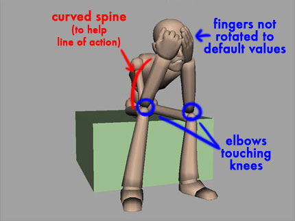
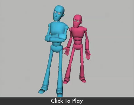
Let's look at one more comparison of a typical poster-frame pose:
Again, the intention of this pose is clear. This is a sassy character, telling someone to "talk to the hand." What, then, makes the second image more dynamic than the first?
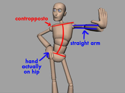
To begin, this pose takes advantage of the classical art technique of "contropposto," which is a fancy way of saying "the hips are rotated at an angle opposite to the shoulders." Using contropposto helps a pose achieve a sense of fluidity and balance. Compare this with the first pose's spine, which is essentially a straight line. The revised version feels much less stiff, much more natural.
The hand on the hip has been posed as if it is actually touching and resting on the hip, the fingers curved around the body in a natural way. The other hand is coming towards the camera from an arm that is completely straight, lending power to the gesture. The "stop" hand has been tweaked so that the fingers are all at full extension and the thumb is out, making the palm the most prominent part of the pose.
Finally, the face has been worked to emphasize the intention of the pose. Even if the character had no facial features the pose would still communicate. But when we spend some time on the face to bring it into focus with the rest of the pose, it solidifies the character and helps the audience get an instant read on what this character is all about.
I've mentioned in the Helpful Hint, Every Frame Is a Drawing, that I was blown away when I learned that an animator might occasionally spend an entire day on one pose! But the more experience I got in animating, the more I understood how important one pose can be. It can sell or ruin your entire scene. The time put into making a pose just right can dramatically save you time and effort, not to mention frustration, when you're animating.
A solid pose can hold the audience's attention and tell them what your character is feeling. A mushy pose will leave the audience uncertain and uninvolved with the story.
Don't fall into the trap of believing that people will understand your animation once in starts moving. Since Every Frame Is a Drawing, the first drawing will leave a mighty big impact. Make sure it's the kind of impact you want to make.
COMMENT #3
"Your animation feels too swimmy / too computer-y / too weightless."
Timing is one of the most difficult animation principles to get right. We want our characters to feel natural and weighty, but all too often we will err on the side of moving things too slowly. We'll use too much ease-in and ease-out of our gestures, resulting in animation that looks like the character is acting while submerged in an invisible pool of water. That's why we say that this kind of animation looks "swimmy."
I was having this exact problem while working on a shot a few years ago. All of my moves seemed to take too long. No matter how I tweaked my graph editor, the animation still looked wrong. I asked a co-worker, an experienced 2D animator, to have a look and offer any advice he could. What he told me was so very simple, and yet it changed the way I thought about animation from that point forward:
"Take out some in-betweens," he said.
As a 2D animator, he wasn't thinking in terms of the graph editor, or f-curves, or computer interpolation. What he saw was a series of drawings. And he instantly saw that there were too many of them. I needed to take some of them out. And it's important to note that he didn't recommend that I change any of my drawings (changing the tangent of an f-curve will change the 'drawing' on several frames at once); he just said that some of them should be removed.
The trick is knowing which ones to remove.
Let's take a look at how this might work with a simple bouncing ball. Here is the bouncing ball we'll start with.
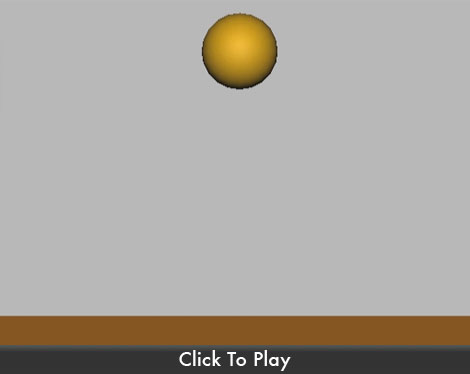
We can see that it's looking decent--which is to say the ball is spending more time in the air than on the ground. But it's also clear that this ball isn't moving naturally at all. At certain points the ball seems to race upwards after moving slowly, and at other times it seems to descend slowly towards the ground as if it is defying gravity. Even the hang-time, the time the ball spends at the top of its bounce, feels uneven. These are all things that we can tweak simply by removing some in-betweens. Here's how I would approach the situation:
1) Select all of the character controls (in this case, it's just the ball)
2) Set a key on every frame. Think of this as setting down your 'drawings' on every frame. (watch your graph editor to make sure your new key tangents aren't changing the other 'drawings'
3) Decide which 'drawings' need to disappear, then select the keys on those frames and delete them.
4) Slide the remaining keys one next to the other until there is once again a key on every frame.
Our original ball bounce took 158 frames to settle to a full stop. After we take out some in-betweens, we are left with a much leaner 77-frame animation that looks like this:
Notice that these are the exact same drawings we had in our first ball bounce, but many of them have been removed. (use the arrow keys on your keyboard to frame forward and back through the quicktime-- the frame counter will show you which frames are being used from the original)
I find that this technique helps mostly in the blocking/breakdown stage of animating, but it's often been useful to me during the polishing stage as well. It's up to you to determine how to make it work best for yourself. Once you start taking out those in-betweens, I am certain you will find fewer comments about your animation feeling "floaty" or "swimmy."
Incidentally, the most common place I see this kind of swimminess is in a character's head movements and hand movements. Hands and heads actually move pretty fast, and are quite heavy when you let gravity take them over. If you're getting comments about your animation looking too computer-y, too swimmy, one of the first places to look for the culprits will be in the head and the hands.
A lot of beginner work in CG suffers from the floatiness of hands and heads. Especially if a character is gesturing with their hands, and then relaxes their hands by their sides. Your instincts may lead you to have your character's arms softly float back to the side of the body. But in reality, hands and arms will drop pretty quickly to their resting position as soon as your muscles stop holding them up in the air.
The same thing will happen when you drop your head, or even turn it. It will probably take fewer frames than you'd guess.
Paying attention to gravity's effect on your arms and head when they're relaxed will go a long way towards making the weight of your character believable.
COMMENT #4
"Your character's energy doesn't match the dialogue."
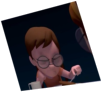
One of the tricky things about animating to pre-recorded audio is that the vocal performance will drive your acting choices. If the actor in your audio clip sounds tired and you animate your character doing gymnastics, the scene will come across as insincere and unbelievable. Likewise, if the audio gives you a character who sounds frantic and distressed, you will be doing your audience a disservice when you show them a character who appears relatively calm and composed:
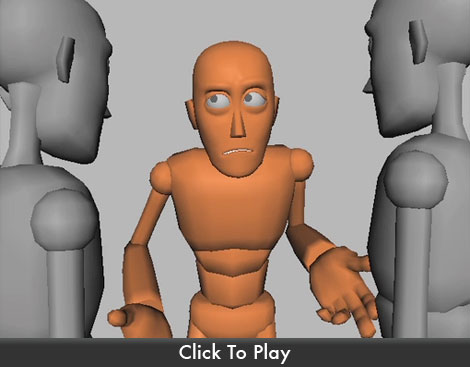
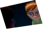
The actor in the audio clearly has a lot of intense energy, but we see the character on screen using very small gestures. If I were to turn the audio off, you might think that he was simply talking to two friends about everyday mundane matters. The audio clip demands that we give this character some acting choices that portray his disturbed mental state:

Now we see visually what we have already heard in the audio. If we were to perform our turn-off-the-audio test with this second animation, we would still see the essential thrust of the scene: this character is frantic, practically begging. The larger gestures are appropriate for the audio clip in a way that the smaller gestures were not.
Be careful, however, not to confuse "large gestures" with the animation principle of exaggeration. Exaggeration doesn't simply mean "make things bigger." It is more often about increasing the visual intensity of a pose, even if it's a smaller performance. Let's have a look at another audio clip demonstrating this:
The gestures here are large, and the poses are clear. It's a decent, average performance. But if you listen to the actor in the audio, she sounds much more quiet, almost as if she's speaking to herself more than to the person standing in front of her. This kind of introspective performance seems to ask for more intensely muted acting choices:

Even though these gestures are small, they can still be considered "exaggerated." They intensify the moment, making the character appear drawn into herself, and very protective of this "strange little creature" just as the audio suggests.
When you listen to your audio, you should listen to it over and over and over. Listen not only for the words, but also for the nuances of breaths and intonation of certain phrases. Listen for the energy of the dialogue, for the emotional state of the character speaking the lines. Get out of your chair and act the scene out once you have heard the audio so many times that it's completely embedded into your brain. You will be able to feel in your own body when your acting choices match up with the energy of the original performance. That's what you should be aiming for when you craft your animation.
COMMENT #5
"Your camera moves are much too distracting!!
I can't see your animation because the camera is moving so much!"
I remember when I opened my first 3D software package. I think it was-- don't laugh-- I think it was Bryce 2. It was magical. With the click of a button I could create a mountain range, a deep and shimmering ocean, or a perfectly round metallic sphere reflecting in all of its shiny glory. What thrilled me most, however, was that I had the ability to navigate the scene to see it from any angle! I mean, can you imagine? No longer was I bound to the 2 dimensions I had dealt with so long on paper, or even in the video games I played on my computer. Now I could rotate around objects whenever I wanted to, and all of the proportions and angles would look exactly as they should. I was so excited!
My excitement took a second leap forward when I found another 3D package that easily allowed me to animate the camera. Not only that, but I was given a target for the camera to point at so no matter where I moved the camera it would always be focused on one spot! I spent a long time just moving that camera around, amazed that it could show me my scene, my animated scene as I rotated around it!
What I'm getting at is this: I understand the thrill of moving a camera in 3d space. It's powerful and fun and exciting. But when you're trying to create a cinematic experience, whether it's a 2-hour feature movie, or an 11 second animated piece, there is a lot to learn about how to use a camera effectively. The best place to start is to set your camera in the scene and leave it alone:
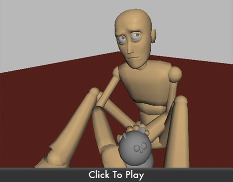
Oh, I know it can be tempting to try one of those dramatic camera-and-target moves:
But you will rarely find an 11 second audio clip worthy of this kind of dramatic treatment, for the simple reason that dialogue and emotoin rarely motivate a camera move. In fact, you hardly ever see this kind of camera move in a film, so why include it when it is bound to distract from the performance you're giving the audience?
An even worse culprit is the camera move that seems entirely unplanned, undisciplined, and unmotivated:
If I had to guess, I'd say this kind of camera move is created by a beginning animator who doesn't have the grasp of the software to control a camera's animation. To this animator, and to all others for that matter, I would strongly urge you to place your camera in one spot, set one key frame, and leave the camera alone. This is a character animation competition, after all, and the focus should be on building and demonstrating your character acting skills. It's difficult to demonstrate your acting skills if your camera prevents your audience from seeing them.
If you truly are interested in learning more about how cameras can effectively be used to enhance the emotional content of a scene, there are many resources out there. One that comes highly recommended is Steve Katz's "Shot By Shot." This book has a lot of great information about storyboarding, composition, camera angles, lenses, editing, and how to effectively contribute the storytelling of a film from behind the camera.
But even the professionals, those big famous moviemkers, know that most of the time it's enough to leave the fancy camera work alone and let the actors carry the scene:
Listen, I know it can be a downer to receive a low score after you've worked so hard on your animation. And sometimes the comments we receive can seem callous, flippant, or even mean. It's so easy to forget that what takes us 11 seconds to watch took hours and hours of hard work, thought, research, and frustration to animate.
Try to keep in mind that everyone starts at the beginning. All of the Pixar, Disney, Dreamworks, and Sony animators you admire... all of the Glen Keanes, Hayao Miyazakis, Bill Plymptons... there was a time when none of them could animate at all. It takes hard work and dedication, and making mistakes over and over until you learn how to do it better.
Whether you're in this for a career or just a weekend hobby, don't let those negative critiques get you down. Remember that you're on the same learning curve as everyone else and that as harsh as some critiques might be, they are still more useful to you than if you had not received any critiques at all. So use what people are saying about your work, and find a way to let it help drive you forward.
Good luck, and keep animating!
- Eric
comments powered by Disqus