
Helpful Hints
A collection of tips and tricks to help you with your entries.
Breaking Out
By: Eric Scheur
Published December 7th, 2008
Hello, and welcome to the new edition of the Helpful Hints column at the 11 Second Club!Today we're going to focus on one of the common pitfalls I've seen with many of the entries here at the 11SC, as well as on demo reels from aspiring animators around the Internet. Before we get to that, though, I'd like to start with a small detour into a concept from the world of Graphic Design. I beg your indulgence; I believe you will find this interesting and useful.
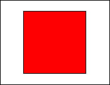
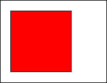
Let's start with a rectangular canvas. Like this:

This is the space we'll be working in, like a poster or a magazine ad. Or a frame of film. The subject of our frame will be a red square. We'll place it here:
The square is rather obvious there in the frame. It's red and stands out from the background, so it's easy to know what we're supposed to be looking at. But it's a bit dull, all centered up like that. Let's move it a bit off-center:
It's a little more visually interesting now. There is more white space on the right side than there is on the left. This gives the composition some asymmetry, which makes things more compelling for the eye to look at.. If we're being honest, though, it's still pretty boring.
What if we took that square and gave it a slanted angle like this:

Ahh, now we're getting even more interesting. Before, we were dealing only with angles of 90 degrees or its multiples (180 degrees, 260 degrees, and 360 degrees), and everything was parallel to the sides of the frame. Now that we've tilted the square, it's as if we've introduced new angles that didn't exist in the frame before. This makes the composition more challenging and intriguing to our eye.
Now hold on to your hat, because we're going to move our square one more time and this one is going to be a lulu:
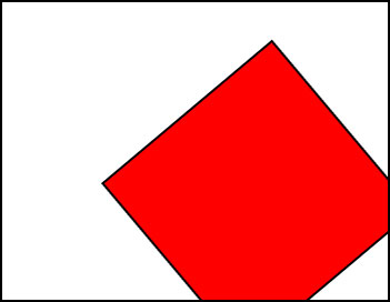
Bam!
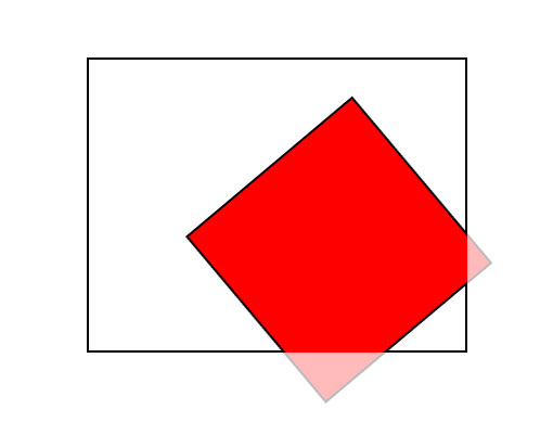
In graphic design, this is called "breaking out of the frame." It's not too hard to see why. The composition practically begs your eye to imagine that the square continues outside of the boundaries of the frame, even though you can't see the other two corners of the red square. All you are given is the rectangular border, but your brain is coaxed to think not only about what's inside of the borders but also what is likely to be outside of it, like this:
Here are some examples from recent print advertisements using this principle, suggesting a world that extends beyond the bounds of the frame:

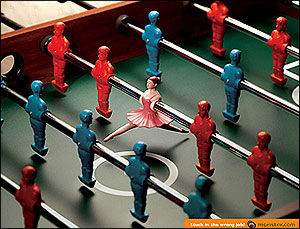
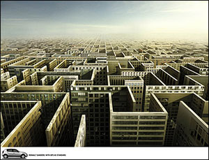
Each of these images use their subjects to help break the frame and imply a larger context to the scene. In the fourth image especially, we get the sense that the world we're being shown extends not only to the left and the right of us, but also extends towards us; that is, that you could stand in the frame and look past the camera and still see more things in the world that's laid out before us. The subjects exist in a context larger than themselves.
Breaking out of the frame can help give your animation context within its own world. That's the idea we will be exploring with our animation today.
It's important that the audience believes that your character exists in a physical space and that they are there for a reason. Many people provide a context for their character by adding props into the scene; desks, or cars, or lamps, or furniture, etc. And while these objects can help a character feel like they are standing within a particular space, I'd like to concentrate on ways of building context even when there is no background at all.
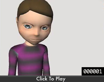
Just like our "red square" example above, let's start here:
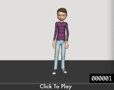
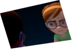
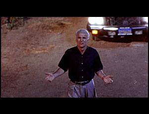
Here we can see the full character from head to toe. Every single bit of the character is contained within the frame. I see a lot of animators placing their character in their scenes like this. But just like that first "red square" composition, this staging feels very flat. The character is completely isolated, as if he exists in a vacuum.
It's rare to see this kind of staging in film because it breaks the illusion that the character exists in their own world. Instead, it feels as though our character has walked into an empty room in order to deliver his line for the audience. Because of this, the performance seems contrived and insincere.
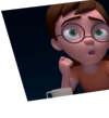
So, what can we do to improve the illusion of a larger context? Well, we could place our camera a little closer, like this:
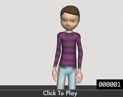
Now the character is breaking out of the frame a little bit. Like the square that left the boundaries of the frame, we feel that there is a little more to this world than the camera is showing us. We know that the character's body does not stop at his chest--so our brain helps us imply rest of his body, which implies his legs, which implies feet and a floor to stand on. It no longer feels like our scene is bound inside of the frame. We're starting to open things up.
But this composition is still pretty limited. Sure, the character is breaking out of the frame, but he's only leaving the frame in the X and Y axis, which makes the scene feel very flat. After all, the when we look at the world around us there are many things which aren't only parallel or perpendicular to us.
This leads us to a big, mind-blowing question: Is it possible to have the character break out of the frame... in the Z-axis?
Even though we don't have the ability to make the character literally come out of the frame towards the audience (unless you have some kind of fancy holographic technology from the future), we can imply that our character exists in a fuller context by having his attention focused on a second character:
When our character looks beyond the frame, we get the idea that he's talking to someone else: someone we can't see because they're behind the camera. This is what brings our brains into that third dimension of the frame, implying "this space does not stop at the camera lens." This is how filmmakers fool the audience into believing that their characters inhabit a fully-realized 3-dimensional world, even though we only see the images in a 2-dimensional plane.
What we're really tapping into here is a kind of "cinematic vocabulary" that we've all learned to read. We've all seen a lot of movies, dozens every year throughout the course of our lives. Without paying any attention to it, we've been trained to accept certain visual conventions that directors have discovered to create space, mood, action, etc. And just as there are basic principles of character animation, there are basic principles of camera placement and scene composition. The "looking-beyond-the-camera" setup we've been playing with is a very basic use of the camera and a character. There are tens of thousands of ways that you can play with your camera to help you add space and context to your scene, not to mention saying something about your character.
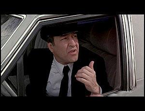
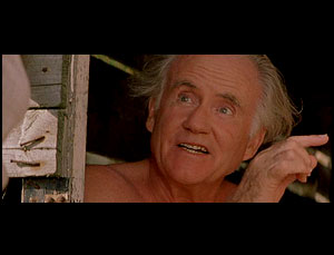
Here are some other ways of staging a character so they look beyond the frame:
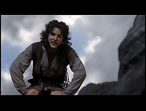
I'd like to finish this Helpful Hints column with a look at the actual clip that our sound file comes from. This is from the movie Amadeus, directed by Milos Forman. The actor is Tom Hulce, who plays Wolfgang Amadeus Mozart:
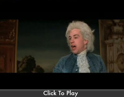
Notice how even though you don't see the character Mozart is talking to, we are intensely aware of his presence. Mozart does not look off-screen in a vague direction, his attention is focused on the man he is speaking to. Not only that, but you can tell some other important information simply from how this action is staged. Notice how Mozart begins this shot sitting down, and also that when he speaks, his eyes are also directed at someone who is sitting down. So even though we don't see the other character, we not only know the direction they're in relative to Mozart, we also have a pretty good idea about what they're doing! We can also tell from Mozart's eyeline that this person is not sitting directly in front of him or sitting twenty yards away, but is probably around ten to fifteen feet from him. This is a lot of information to get about someone we can't even see!
Look at the films you enjoy watching. See how the director sets up the camera, how the scenes are composed, and how they cut between each other. Try using some of these setups in your own 11 Second Club animations. Emulating film is not only a really good way of creating visual interest, but it's also great practice for paying attention to what films do and how to stage your characters and scenes more dynamically. When you begin to take advantage of this visual vocabulary from film, you can lead your audience wherever you'd like them to go.
- Eric
Discuss this article in the forums
comments powered by Disqus