"Ethical Implications"

Final Rating: 3.8. Finished: 35 out of 43 entries.
Previous Animation
Next Animation

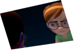
Animator: Eric Leidenroth

Description: This is my first posting here. I took the email approach to the letter, and enjoyed bringing everything to life. I'm looking forward to next months competition already, hopefully I'll have the time.

Experience: Off and on for about 4 years.

Time taken: 38 hours

Comments:

(Commenting only available during the rating period)

Erik Griott:

i think the red character is doing a lot, and i dont understand the reaction of the orange character halfway through the scene. overall, the motion is kinda liquidy.

Rich Lauzon:

There's something funny about the mouth movements... I can't quite put my fingure on it.. Its like they never really close or something... I dunno..

P Walters:

Interesting choice on the light switch. I like it. The animation movements/choices don't seem very natural, they seem a bit forced. I like the pointing and when he rubs his head. Those feel good.

Jett Atwood:

Watch the twinning going on...also he feels a bit mushy. I like the gag at the end though.

Steve Sloan:

It looks like you are using ik for the hands, they seem to float unnaturally. Also they didn't seem to a pose enough. the guys body on the right was always smoothly moving mainly around frame 180

Frank Collazo:

great end

Virgil Mihailescu:

hahahaha, very funny. you've managed to make it funny!! that's awesome! but the animation is sort of floaty, and part of the lisync is off. this one had a good chance of being among the best, if the quality of the animation would have matched the really cool idea.

Marcos Borba Moreira:

nice animation, a little bit loosy and slow, but i liked the idea, very original with the lights!!!

gerardo:

I found somes uncomfortable, unatural poses.
the idea is good

Traci Plagmann:

I really like the light switch coming on at the end - that's very clever.

Great start. Good staging and acting decisions. A lot of the gestures are pretty floaty though. Work on really hitting and holding the poses.

Missy Feaster:

Give your character opportunities to stop moving, occasionally, and watch out for that twinning. Lookin' good, though.

Dan Dulberger:

It's not terribly so but abit floaty.

Dhar:

"Plenty of room for improvement"

All done! ;)

Theo Edmands:

Nice unique interpretation of click sound at the end.

Maurice:

Hi, it's kind of floaty in certain parts. And teh position of the hands at frame 77 is abit weird. But good work.

Victor Wong:

It's true that the major sync points are hit, and the acting for the most part works at those points. However, there's an "idle drift" on the part of both characters that's a little too even to be realistic.

Michael Twentyman:

interesting take on the 'switch' sound. movement by superhero guy is a bit spastic. facial expressions feel way off.

C. J. Cow:

i like the idea someone turns on the light at the end

Chad Hannah:

characters are floaty. Gestures come a little too late after the emphasis on certain parts

Aaron Clement:

Hehe... nice move with the light switch! I like it! You get a bonus point for that! It's always good when it's more imaginitive. The hand on the shoulder was good... just needs more moving holds... Great ending!

Damodar V Sawant:

your animation looks very even...you dont have slow ins and slow outs in it...try to make use of these principles ...also make use of over shoots.....and acting needs improvement.......

Taber Dunipace:

This piece is lacking in animation principals and polish. The concept is sound enough and the acting choices are straight forward, but more study is needed to achieve quality animation.

Christopher Lutz:

Nice. Arm/hands movements are not clear.

Bilal Ahmad:

postures need to be at exact places when the specific sentences are spoken

Robert-Jon Eckhardt:

Good thinking on the light!
The right guy's animation is very floaty. Seems like he has no control over his body. End poses are strong. Overall the animation lacks impact.

Alison K. Sanders:

Hey, Good idea. I like the way you placed the characters and the way that you interpreted the idea.

I think your lipsync on the red shirted guy is a bit off. Make sure that you are hitting the closed shapes a bit more all of the b's, p's and m's.

Also, all of your gestures are quite large and often twinned. Think about toning it down a bit so that you have some place to go when you want to really push it, such as at the end when they throw their hands up.

Gabe Dill:

a little "floaty" on the main character. the poses are quite nice but he never really stays put enough for people to see them. great light idea.

Gregory Marlow:

Very floaty.

Chris Smith:

Not bad animating, however, there's too much "floatiness" to the characters movements. The movements are not snappy and/or clear enough.
Also, the two characters move too much at the same time, so I don't know which one to look at first. I keep looking "in between" them, because their hand actions overlap too much.
However, it's good you did use the whole body to communicate your message. That was a plus.
Just make your actions clear and distinct.

Jennifer Anaya:

the animation looks too floaty. i think it needs a bit more refining, but looks promising.

Roshan.k:

timing is even...there's no slow in/out for alfred's actions...acting and poses looks good.

Eric Scheur:

Oooh! Nice interpretation of the "click" at the end!

Overall, I get the ideas that you're putting across here, and you show a strong instinct for posing. However, the poses tend to drift from place to place, without weight. I'd concentrate more on the body mechanics--studying how different parts of the body move and stop themselves from moving. Finding places to hold your poses will really help sell your acting and make sure people see your ideas clearly.

Good luck in the next round! :)

Jônatas Kerr de Oliveira:

very nice animation... maybe should reduce the amplitude of the arm’s movement... that’s a little strange

Olivier Ladeuix:

a lot of floatiness here too. Hold your poses a bit more instead of floating from one to the next.

Mike Courtney:

The lip-sync on the guy on the right needs improvement and he seems floaty. The key poses need moving holds. Good work on maintaining the interaction between the two characters.

Max Herzfeld:

Good start.
Work on the orbiting arms. Give them beats and emphisis to tell the story.
Overall good work.

Christiaan Moleman:

Most of your gestures are bit floaty. They take too long and move at a constant pace. And try and pause on a gesture... hold it so the audience can let the idea sink in. Don't try to do a new gesture on every line. Only do a new gesture for a new thought.