Phil's brothers new home

Final Rating: 2.59. Finished: 68 out of 85 entries.
Previous Animation
Next Animation

Animator: Debra Wootton

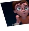
Description: Decided to use flash for this animation as I've spent a lot of time with 3D lately.

Hope you like it and I look forward to your feedback.

Experience: In my third year of a digital animation degree

Time taken: Hmmm, maybe a week all together, not sure as I've done bits as and when I could.

Comments:

(Commenting only available during the rating period)

Taber Dunipace:

Very stiff. Get the whole body into the gestures and make them natural. Probably going to want to go back and do some basic animation tests such as the bouncing ball.

Keep at it!

Joe Garhan:

needs a bit of work on the perspective

Paulo Clayton:

Seems a bit out of sync, behind the audio. Nice shot at a specific style, though.

Ken Rice:

Nice look to your animation - but I didn't think there was enough expressive animation going on.

Greg M. Johnson:

Visually appealing. Could use some more expressiveness.

Erik Westlund:

You are trying so hard to make sure we know where he is headed that lots of other things seem to have been sacrificed. Characters are jammed into car like sardines, giving you no room to animate them. Important character signals are reduced to simple movements like the Phil's head nod at the beginning. Movements are not believable.

trish breslin:

there should be more expression in the characters faces and in their movements.

Max Rodriguez:

You need to work the logistics on this idea. How does the sign stay static for so long, though they're driving?

Aaron Clement:

Haha... nice one. They felt pretty stiff... but I guess that's the style you were going for.